Research For Conceptual Screen Design
Design Considerations
There are three factors that should be considered for the design of a successful user interface; development factors, visability factors and acceptance factors.
Development factors help by improving visual communication. These include: platform constraints, tool kits and component libraries, support for rapid prototyping, and customizability.
Visability factors take into account human factors and express a strong visual identity. These include: human abilities, product identity, clear conceptual model, and multiple representations.
Included as acceptance factors are an installed base, corporate politics, international markets, and documentation and training.
Visible Language
Visible language refers to all of the graphical techniques used to communicate the message or context. These include:- Layout: formats, proportions, and grids; 2-D and 3-D organization
- Typography: selection of typefaces and typesetting, including variable width and fixed width
- Color and Texture: color, texture and light that convey complex information and pictoral reality
- Imagery: signs, icons and symbols, from the photographically real to the abstract
- Animation: a dynamic or kinetic display; very important for video-related imagery
- Sequencing: the overall approach to visual storytelling
- Sound: abstract, vocal, concrete, or musical cues
- Visual identity: the additional, unique rules that lend overall consistency to a user interface. The overall decisions as to how the corporation or the product line expresses itself in visible language.
Principles of User Interface Design
There are three fundamental principles involved in the use of the visible language.- Organize: provide the user with a clear and consistent conceptual structure
- Economize: do the most with the least amount of cues
- Communicate: match the presentation to the capabilities of the user.
Organize
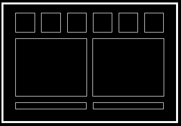
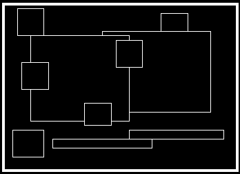
Consistency, screen layout, relationships and navigability are important concepts of organization.Example: Chaotic Screen Example: Ordered Screen
Consistency
There are four views of consistency: internal consistency, external consistency, real-world consistency, and when not to be consistent. The first point, internal consistency states the same conventions and rules should be applied to all elements of the GUI. ![[dialogue boxes]](https://lh3.googleusercontent.com/blogger_img_proxy/AEn0k_tFKkzrc5rxfOADa39LQU21W3ZDM81gbds8VncwN8jsOqRw65QJY9eimmGSsvu9mt1NmDZahSzll5TKPb99MKvCLM2AdKHRew312dr-7_CUhnadO3NQ7sG0n8mvxXGQ21ALQSKRa8GgLKLCTdo9lA=s0-d) Example: Internal Consistency - Dialogue Boxes
Example: Internal Consistency - Dialogue Boxes
Same kinds of elements are shown in the same places.
Those with different kinds of behavior have their own special appearance.
External consistency, the second point, says the existing platforms and cultural conventions should be followed across user interfaces.
![[text tool icons]](https://lh3.googleusercontent.com/blogger_img_proxy/AEn0k_teUPNcZLbZ--wT6f2AFIlLi3Vbd2i2malm7_qlFesdqRdl5whWI8fjKXI2MNqBov8j4gjWgxzHUCaXHbuj49Hd_FYZQgruN-v6zidjH98hldmQeiMn72ossN2vtp8Fp33vf8mQpMSIDIumgkke6Q=s0-d) Example: External Consistency for Text Tool Icons
Example: External Consistency for Text Tool Icons
These icons come from different desktop publishing applications but generally have the same meaning.
Real-world consistency means conventions should be made consistent with real-world experiences, observations and perceptions of the user.
![[Highway signs for icons]](https://lh3.googleusercontent.com/blogger_img_proxy/AEn0k_uNVz2VyhAk0skKfsXBnrc1-YukziI1v3UmAxmrOfOfTpyJc2zGp_5bL8xwoiI2_q_kd6OxTkNk02oW_q6vBWOgbOHogKxmX7eWp4SqwjzIEeR4aHiDNk_cYqBJKkcyMgpMY4Zgm_nx0l37psE=s0-d) Example: Real-World Consistency
Example: Real-World Consistency
The last point, innovation, deals with when not to be consistent. Deviating from existing conventions should only be done if it provides a clear benefit to the user.
Screen Layout
Three ways to design display spatial layout: use a grid structure, standardize the screen layout, and group related elements. A grid structure can help locate menues, dialogue boxes or control panels. Generally 7 +/-2 is the maximum number of major horizontal or vertical divisions. This will help make the screen less cluttered and easier to understand.Communicate
The GUI must keep in balance legibility, readability, typography, symbolism, multiple views, and color or texture in order to communicate successfully.  Example: Illegible and Legible Texts
Readability: display must be easy to identify and interpret, should also be appealing and attractive.
  Example: Unreadable and Readable Texts:

           Unreadable: Design components to be easy to interpret and understand.                        Design components to be inviting and attractive.
 Readable:   Design components to be easy to interpret and understand.
                       Design components to be inviting and attractive.
Typography: includes characteristics of individual elements (typefaces and typestyles) and their groupings (typesetting techniques). A small number of typefaces which must be legible, clear, and distinctive (i.e., distinguish between different classes of information) should be used. Recommendations: - maximum of 3 typefaces in a maximum of 3 point sizes - a maximum of 40-60 characters per line of text - set text flush left and numbers flush right. Avoid centered text in lists and short justified lines of text - use upper and lower case characters whenever possible.


Example: Recommended typefaces and typestyles
Multiple Views: provide multiple perspectives on the display of complex structures and processes. Make use of these multiple views: - multiple forms of representation - multiple levels of abstraction - simultaneous alternative views - links and cross references - metadata, metatext, metagraphics.
 Example: Verbal and Visual Multiple Views
Color
Color is one of the most complex elements in achieving successful visual communication. Used correctly, it can be a powerful tool for communication. Colors should be combined so they make visual sense. Some advantages for using color to help communication: - emphasize important information - identify subsystems of structures - portray natural objects in a realistic manner - portray time and progress - reduce errors of interpretation - add coding dimensions - increase comprehensibility - increase believability and appeal
When color is used correctly, people will often learn more. Memory for color information seems to be much better than information presented in black-and-white. There are some disadvantages for using color: - requires more expensive and complicated display equipment - many not accommodate color-deficient vision - some colors can potentially cause visual discomfort and afterimages. - may contribute to visual or may lead to negative associations through cross-disciplinary and cross-cultural association.
Color Design Principles
The three basic principles can also be applied to color: color organization, color economy, and color communication. Color organization pertains to consistency of organization. Color should be used to group related items. A consistent color code should be applied to screen displays, documentation, and training materials. Similar colors should infer a similarity among objects. One needs to be complete and consistent when grouping objects by the same color. Once a color coding scheme has been established, the same colors should be used throughout the GUI and all related publications. The second principle of color, color economy, suggests using a maximum of 5+/-2 colors where the meaning must be remembered. The fundamental idea is to use color to augment black-and-white information, i.e. design the display to first work well in black-and-white. Color emphasis suggests using strong contrasts in value and chroma to draw the user's attention to the most important information. Confusion can result if too many figures or background fields compete for the viewer's attention. The hierarchy of highlighted, neutral, and low-lighted states for all areas of the visual display must be designed carefully to provide the maximum simplicity and clarity.
Color communication deals with legibility, including using appropriate colors for the central and peripheral areas of the visual field. Color combinations influenced least by the relative area of each color should be used. Red or green should not be used in the periphery of the visual field, but in the center. If used in the periphery, you need a way to capture the attention of the viewer, size change or blinking for example. Blue, black, white, and yellow should be used near the periphery of the visual field, where the retina remains sensitive to these colors. If colors change in size in the imagery, the following should be considered: as color areas decrease in size, their value (lightness) and chroma will appear to change.
Use colors that differ in both chroma and value. Avoid red/green, blue/yellow, green/blue, and red/blue combinations unless a special visual effect is needed. They can create vibrations, illusions of shadows, and afterimages. For dark viewing situations, light text, then lines, and small shapes on medium to dark backgrounds should be used in slide presentations, workstations and videos. For light-viewing situations, use dark (blue or black) text, thin lines and small shapes on light background. These viewing situations include overhead transparencies and paper.


